2007/09/05

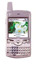
Treo 680: 8 months later...

Back in december 2006, when the Treo 680 was released, I had a (relatively) hard time getting hold of one, mostly because Palm had announced the release of that device much before it was actually available on the European stores shelves. Palm even managed to lose a good many sales, I think, by making sure the supplies were still short while every French geek out there was shopping for Christmas gifts... :-(

So when I finally got one, I was like a child with his new toy, my eyes sparkling with pure joy and impatience!

Now, more than 8 months have elapsed, quite a long time actually in the PDA/smartphone's world, and to be honest I've been really busy at work and had no time to write this article sooner. On the other hand, 8 months of daily use is more than enough for me to make up my mind and decide what I really think about the 680, so here we go: I'll fist cover the strong points (in my view, at least, as there's no such thing as a "one size fits all" in this geek world), then its shortcomings.

1) The form factor. While not the lightest, smallest, thinest device I've had, especially when compared to my previous E61 Nokia, it fills allright in the hand, the screen surface / total device size is quite acceptable, and the keyboard is really usable once you get used to it. So all in all, except of course for the usual "I could use a lighter, thinner device" rant, there's not much that could be changed for the better as far as form-factor goes, the 680 is the product of years of use of its ancestors (600 and 650).

The lack of external antenna is nice, as it makes the device shorter, although I must confess that occasionnaly, I miss the protruding antenna I could get hold of to grab the Treo from its belt case...

The lateral door covering the SD card is a nice addition to the traditionnal Treo design, supressing the constant fear to eject the SD card involuntarily by mistakenly pressing the Treo at the wrong spot. Sure, the tiny door looks flimsy, but it works adequately, and that's all I need since I rarely eject/reinsert the card anyway...

The lack of reset hole is a step backwards IMHO, as you need to remove the Treo from any kind of form-fitting case to open the battery cover and perform the reset by removing/replacing the battery. Given that I currently do no use such kind of case, though, this is a non-issue for me, and I'm glad not to have to run for a paperclip whenever my Treo crashes... (more on this later)

2) The screen. It's bright (most of the time I keep the brightness almost full down, except when I'm in bright sunlight outside), the resolution is just fine (320x320). Of course, I could use a bigger screen or resolution, but given that it would add to the device size, I'm perfectly happy with what the 680 offers. After using the Nokia E61 for a few months, I had managed to convince myself that the lack of a touchscreen wasn't such a big deal, and indeed with cleverly designed applications it was a no-brainer to use only the keyboard or directional pad, but unfortunately there are rather few cleverly designed applications (on the Nokia), and the touchscreen of the Treo 680 makes it really much easier to use than the E61, saving you the hassles of having to click your way back to the top menu or screen by repeatingly selecting the back/close/done menu. The touchscreen lets you shortcut your way much faster in the average application.

3) The OS. Well, sure, the PalmOS needs some work to make it prettier, or more efficient (did I hear WiFi SDIO or 3G requests in the audience?). But right now, outdated as it may be, it's still one hell of an efficient OS to handle your PIM needs. Address book, Date Book, Memopad, ToDo, you've got all the basic stuff right from the start, out of the box. Unlike, say, the E61 where the memopad-clone is a bad joke. I admit that the builtin PIM apps aren't very powerfull but they're more than adequate for a basic use. And if you need a beefed-up version of one of the builtin apps, with, say, color or categories, or icons support, you can find it easily in the myriad of available PalmOS freeware, shareware or full-grade commercial apps easily found on the major software repositories. The good side of being an outdated OS is that it has left plenty of time to developpers to port their application to the latest version of PalmOS. If the application does need it, that is, as there are more than a few apps out there written for PalmOS 3, for instance, and which will happily run on your OS 5 "modern" PDA or smartphone.
And the OS, if you pay minimum attention to what applications you install (there are a few known problems), i very stable, so I rarely have to perform a reset, and it even more rarely resets on its own! Which is just fine, because the boot time is dangerously long. I mean, when my phone froze with an incoming call, I used to perform a reset, which requires between two and three minutes, whereas letting it "as is" for 30 seconds usualy give it time enough to recover on its own!

4) Data (as in "internet on the go"). While the Treo 680 isnt't 3G-capable, the internet browsing experience is more than adequate for a smartphone... Sure, by the time you read this article, the iPhone will have been released for a couple of months in the US with its desktop-like internet browser, setting a new standard. And the Nokia E61 browser was fine to use as well, but in the end, there are only a couple of website I really need to browse with the Treo, most if not all of them mobile-optimized, so using a limited browser doesn't impact too much the overall experience.

And the fact is that most of the time, I don't even have to use the buitin browser, as there are many specialized applications out there that connect to the internet and handle the needed data "under the hood", providing the end user with a good interface and pleasant experience... If I want to get some weather forecasts, maps, currency exchange rate, news, I can use Handy Weather, Google Maps, Palmary Clock Wireless or mRSS. Since they don't need to download a full-featured web page with hundreds of Kb of useless data (ads banners, shiny graphical menu buttons, heavy script code for flashy special effects) but rather only a few kb of encoded or compressed data, the speed is acceptable even on a 2G or 2.5G network, and the cost is incomparably lower (remember that here in France the iPhone hasn't been released yet, and that there's still no such thing as an afordable unlimited monthly data plan)!

All in all, for email handling (I don't use email at work, so I don't need to handle large attachments), limited web browsing, a few optimized internet-enabled applications, the Treo 680 is just fine. I could use WiFi, sure, if it was an option, but even on the E61 I had troubles login on some non-free HotSpots, so I found out that throughout Europe, using the phone network is generally more efficient than WiFi - if you don't need to transfer huge amounts of data, that is. Coverage is almost ubiquitous on the old continent, the roaming charges may certainly impact the monthly bill, but there's no tedious loging procedure, and no credit card number to give, so for everything but movie or music download it's more practical than WiFi...

Now that I've written in depth about what I like on the Treo 680, let's have a look at what could be improved:

1) Phone call handling & quality. The built-in phone speaker (the one located above the screen, which gets near your ear when you're calling someone, not the speaker on the back of the Treo) is a bit too weak. Even with the call volume set full up I sometimes have troubles hearing the person I'm talking to. The overall quality is average, but the most concerning part is that sometimes the Treo seems to "freeze" when answering a phone call or trying to initiate one. It doesn't happen to me as often as it seems to happen to a few other users, though, but at least on the phone side of things, the E61 was fault-less, so that's an area where the Treo could use some improvements... I hate it (and so do the people trying to call me) when I miss a call just because the Treo decided to take a 30 seconds vacation. That was the primary reason why I stopped using the Qtek 9100 after a few months: because of the high missed call rate. I've read that the iPhone is simply average as far as phone call quality is concerned, but it'll be interesting to see if there are any missed calls with this smartphone...

2) Battery life. While the first weeks after the 680 release were quite chaotic on this particular subject, the release of a couple of patches by Palm have at least reduced the battery life issue to a minor annoyance. Sure, I'd like to be able to use my 680 for three or four days in a row without having to recharge the battery, but things being as they currently are, with my (moderate) usage pattern, I can go for a two days trip without my AC charger without much trouble. Only the fact that I dislike having the battery meter drop below 50% prevents me from letting it go three days without being recharged, actually, which leaves plenty of rooms for improvements but is quite useable 'as is'. The good thing with the battery is that it's removable, so at least you can carry a spare one with you instead of the charger for medium-duration trips, but battery life isn't an area where the Treo 680 shines, especially considering the fact that it's not even using 3G or WiFi!

3) The processor is a bit slow in some situations (opening a big Excel or Word file with Documents to Go, for instance). The good side of this choice is that it helps increasing a bit the battery life, but it occasionally makes the device sluggish... Having an outdated and "ugly" (as in "not many eye candy trendy features") OS does help alleviate this issue, too. By chance I happen to use my Treo 680 mostly as a PDA/smartphone, but whenever I want to open a pdf file at work, I'm reminded that this isn't what the device manufacturer had in mind when they calculated the processor requirement...

4) No 3G nor WiFi. Given my particular usage pattern, I can certainly live a bit longer without a 3G smartphone... Having a WiFi option would be nice, though, even if it was a SDIO addon card. Unfortunately, the Treo 680 can handle neither 3G nor WiFi, which is a pity for a device released in late 2006. At least you've got Bluetooth built-in, which allows for quick (well, quicker than using IR anyway) data transfer between a computer (using the standard "send via Bluetooth" option on a Mac, for instance, without having to install any third party application) and the Treo. But otherwise, I keep on reading repors that the 680 will lose its connection with a bluetooth headset. Fortunately, I very rarely use mine, so I've never really suffered from this issue.

5) The camera. It's a (bad) joke, there's no way I (or anyone sane) would use it except in the most dire situation (i.e. if your life depends on it and you have no other digital camera close at hand). Even in 2004 or 2005, almost every (dumb)phone featuring one did a better job than what Palm did. End of story... :-(

So, what's the bottom line?

The Treo 680 is a very capable smartphone. Sure, its hardware is on the outdated side of things, especially considering the numerous WM6 devices featuring smaller form factor with WiFi, GPS and a decent digicam built-in, but it's still a very efficient device to work with. On the software side, there's plenty of choice to alleviate the limitations of the bundled applications. My most prominent regret is that I do regularly miss some incoming calls because of the freezes. Sometimes this will not happen at all for two or three weeks, but at other times it'll freeze two or three times the same day. If your life (or job) doesn't depend on a phone call, then it's OK, you can usually call back the person whose call you missed. But if you need rock-hard phone reliability, then the Treo 680 isn't the right device for you. It's a PDA first and a phone second, unlike the Nokia E61 which was a phone first and a PDA second.

Am I going to keep on using it? Well, let's be honnest, I tend to have a yearly gadget replacement pattern when it comes to smartphones/PDA, and the iPhone is going to be released in France in approximately the good time slot, so yes, I'll probably give it a chance to see if it's any better than the 680. It pains me to leave (again) the PalmOS platform, but seeing that Palm's capacity to innovate has clearly decreased with time, I'm not sure I would enjoy waiting one or two more years just to wait for the next generation Palm devices running Linux. Also, since I have switched from a PC to a Mac, syncing my Treo has proven an often frustrating task to perform, even with the help of MarkSpace's Missing Sync, so I'm more than willing to try Apple-computer-to-Apple-smartphone synchronization, even if this means using iTunes (which I already use for my iPod).

2007/02/02

Reinventing the Palm OS: a few comments

There's a very interesting article on Kent Pribbernow's blog, dealing with the much needed User Interface refresh for the good old PalmOS interface.

While the article is very well written, and illustrated with great UI mockups which are certainly appealing, I have the feeling somehow that Kent is obviously not sharing the same views on the UI than I (and lots of other users) do. Reading the comments to his blog entry, I see a sort of mini flame war raging.

While I consider myself a "long time" PalmOS enthusiast (my first Palm was a Palm V) I do realise that there are a number of people who have been using the PalmOS for even longer time, so nothing here should be interpreted as definite statements, only my own point of view.

One of Kent's hope is that the UI receive a few changes like:

1) Scrollbars. Yes, I do agree, the raw PalmOS scrollbars are a bit to narrow, even for my own taste, and it sure wouldn't take a genius programmer to make them bigger. The ideal situation could be to have their width user selectable within a given range of pixel width. The problem with this is that the applications developpers would have a hard time adjusting their application to the user-selected scrollbar size... :-(

2) A separate application bar and sytem icons bar. While that makes sense in a graphical point of view (i.e. it's nicer to look at, and give very interesting informations if you want them (battery level, signal level for the phone, time/date...). One problem with this, emphasised in some comments to his post, are that such a big bar eats a lot of screen real estate, leaving you with a smaller "useable area" to display text, buttons, whatever your program interface has to display. Kent obviously loves the wide screens (and I certainly do, having owned some great devices with Hires+ 320x480 screens), but on devices like smartphones, you have to chose between a big screen and a keyboard, unless the size gets so bulky most people won't bother purchasing the monster... So you have to be very carefull and design a UI that can accomodate both big and small screens. Tricky, at best!

3) A bottom "quicklaunch" bar with selectable icons also seems like a good idea, although it does eat another couple of rows of precious pixels. But if done inteligently, and combined with the top bar, this can be very efficient (see the Cobalt screenshot at the end of this article for a nice bottom bar)

4) Nice backgrounds, transparency gradients, animated icons, etc... makes for a very polished interface look, and are certainly really appealing, but honestly, I've been dumping apps in the past because you couldn't get rid of those "eyes candy" which, in my case, mostly disturb my attention from the task I'm trying to acomplish (create a memo, check a contact address, send an email...). The key here is that all thos settings, if incorporated into the interface, should be entirely configurable on a one by one basis. I'd trade a longer battery life any day to having the opportunity to put a background image to the Memopad application. Backgrounds, for my eyes, only make it difficult to read the text displayed at the front, and they tend also to be RAM and processor-hungry. But to some (and their number is faaaaar from being small, I'd venture), those "eye candies" are what make a devices pleasant to use, so Palm obviously cannot make new devices without considering this request.

Some PalmOS devices do handle this screen limited real estate as best as the manufacturer could do, like for instance the SGH-i500 Samsung PalmOS phone. On the left picture, you can see that on top of the square display Samsung has added a supplementary icon bar showing the signal level and battery life. I'm pretty sure that some other icons could be displayed up there, so with a very limited cimension increase (we're taklking here to add 16 pixels, not jump from a 320x320 to vertical 320x480 screen), you can cram more information without having to re-invent the PalmOS interface and create too many incompatibility issues (I'm sure everyone remember the release of the first 240x240 square displays for Windows Mobile devices, and how many applications designed for 320x240 screens wouldn't run at all before they were updated).

The bad thing with this approach is that you still have to put your hands inside the built-in applications code, otherwise you end up with what can be seen as well on the Samsung phone: the usual blue battery icon in the Application titlebar, and the additional red batery icon in the top right corner of the screen... It makes no sense duplicating those informations, it just shows that this phone was kind of "rushed" to the market without polishing the UI.

Now look at the three screenshots below:

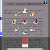
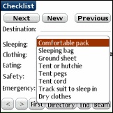
They belong to TreoMemo, Picsel Viewer and Contact5, three very good application who share a particularly refined user interface which contrasts with the "dull" look and feel of the typical PalmOS application (see such an example below:)

Those last two screenshots belong to CacheLogBook and WineMate, two fine freeware applications available for the PalmOS platform. Of course, it's not surprising to see that commercial applications have much more polished interfaces than freeware ones, but this isn't actually where I want to lead you... ;-)

When considering the three polished interfaces from the first screenshot rows, I see three applications which, while they are good and own a cleverly thought UI when taken individually, are completely different, with different choices for icons, buttons, menus (Picsel Viewer is probably the application with the strangest menu design I know of on a PalmOS device). The result, IMHO, is mostly user confusion. Every time you launch another application, your brain has to adjust to its particular interface, whereas "simple" applications like the ones on the second row share a "common interface" as far as look and feel is concerned, so the end user will expect to find a popup menu when tapping on the title bar, to have working keyboard shortcuts that are consistent throughout the whole range of applications, which will result in a productivity boost in the long run. I'm a fervent follower of the "Zen of Palm" guideline, because I feel it makes a lot os sense in an ergonomic point of view, although I admit that it leads to some heavy restrictions on the graphical look of the PalmOS applications.

Now I don't pretend that there's no need to revamp the UI a bit, and the following screenshot, taken from the HikeAssist application, shows that Palm could keep basically the same interface elements as we know them today, and simply make them a bit "sexier" graphically. I don't think that this would cause too much processor overhead, and yet it would probably considered an acceptable "improvement" for everyone except the most fanatic, die-hard PalmOS addicts!


What is evident here is that since there are so many "styles" of PalmOS devices users, one size obviously does not fit all, and Palm needs to put some degree of flexibility into its OS, as far as UI customization go. But on the other hand, as pointed by some in Kent's blog comments (or acknowledged by Kent himself), UI customization third party apps tend to make the whole OS slower and more crash-prone, so Palm may not be willing to jump for the whole "bells & whistles" UI set immediately.

It's really too bad that Cobalt never made it onto an actual device, as I did like the look of it. On the following screenshot you can see that PalmSource had done some good work on the bottom bar (not too large, and a lot of info packed down there, although I'd have gone for a bit more color. Color can convey informations in a space-limited environment in a very efficient way):

2007/01/07

From the Treo 600 to the Treo 680

A couple of weeks ago, I finally received my long awaited Treo 680...

Let's begin this post by a few rants targeted against Palm:

1) Why do you have to screw up almost every launch? The devices tend not to be available for months after the official launch of the product, even in the case of exclusive carrier offers, so it's really frustrating for the end user to wait, and wait, and wait before receiving its new smartphone. I personally know a few people who would have purchased one, had it be available sooner. And here in France, the Treo 680 was NOT available in the brick and mortar stores (I suspect that it was on backorder on most of the web stores as well) for Christmas. Bad policy, Palm! Even if the delayed availability was intentional (for marketing purposes), IMHO it's not that good, as the (future) user's expectation grow up as they wait, and the unfortunate conclusion is that a lot of them are more or less disappointed when they lay their hands on the device. I won't even mention the "rumor" about manufacturing problems with the microphone not being correctly soldered to the motherboard on thousands of brand new units leaving the factory... What a (bad) joke if this is true!

2) Ok, so the 680 started trickling in slowly to the users. Hmm... maybe flowing in the US, anyway, but not so fast on this side of the ocean, I fear. Anyway, a couple of things that I immediately purchase with a new smartphone or PDA are: a screen protector (a Brando UltraClear Screen protector, as usual, available here: http://shop.brando.com.hk/ultraclearscreenprotector.php), a case (I've found out that a cheap (15 Euros) "Faconnable" generic phone belt case works just fine for now, although I've ordered a (very expensive) Vaja case that I'm still waiting for), and a 3-in-1 stylus with a ball pen (saving me the hassle to carry a separate ball pen with me).

I do realise that all the "bells and whistles" accessories are never available right from the start, but was pleased to receive the Brando screen protector (along with a very useful USB retractable sync & charge cable) before I even got the 680. That way the screen of my smartphone was perfectly protected right from the start! With the Faconnable beltcase, I could wait months without trouble my Vaja case, so this point, too, is settled painlessly. Now, the stylus...

I have ordered a pack of three Treo 680/750 styluses from Palm's website. They were listed in the "Treo 680 accessories" page, although the item description mentions only a 750 compatibility. But when you look at the picture describing this item, you see three styluses and three alternate plastic tips. Indeed, US users reports confirm that the styluses are Treeo 750 models, but that the three spare tips ensure the Treo 680 compatiblility.

Alas! When I received my stylus pack, there was only the three 750 styluses in the box, and no additional 680 tip. I've since returned the styluses, but I really can't understand why Palm would market different packages depending on the country. At the time I ordered the styluses, both the 750 and the 680 were officially available in France, and only the 680 in the US, yet US users get both styluses (including those for a yet-to-be-released device) when here in France 680 users have to be cautious not to lose their stylus, as NO REPLACEMENT IS AVAILABLE AT ALL! Unbelievable.

3) One side note about the 680 cradle. Yeah, I've ordered one along with a spare battery, and the 680 battery life makes me think that was a clever decision! ;-)
Except that the 680 cradle is in fact the same cradle as the Treo 650 one. Fine, I thought, if the device outer shell design is similar enough, why bother? As a matter of fact, the bottom of the 680 isn't quite the same as those of the 650. As a result, when I put the 680 in the 650 cradle, it immediately connects to the battery charge pins, but the connection to the syncing pins on the connector is much more difficult to achieve. The first couple of times, I didn't notice anything special, but now I have to insert something between the back of the Treo 680 and the cradle, so that the 680 stands more vertically, otherwise the hotsync ins't possible at all because the electrical connection is too flaky! :-(

That's about all for the initial rants, and I must say that after 4 weeks or so, I'm really happy with my Treo 680. Sure, there are a couple of issues that are annoying, but until now nnothing that would make me go back to the Nokia E61 (or even Treo 600).

In my next post I'll give more details on the Treo 680 itself, its strong and weak points. Suffice it to say for now that the battery life is rather poor, although not as dramatic as some user report, that the PDA side is brilliant (there are a couple of improvements when compared to the 650), and that the phone side is globally better that on the 650 (better sound, better bluetooth) though still inferior to, say, the Nokia E61. In a nutshell, one could say that the Treo range is a PDA first and a Phone second, whereas it was the opposite for the Nokia E61. This fits my needs much better, but it may not be everyone's cup of tea!

2006/12/03

Back to basic...

Ok, enough rant for now. At least, I'll stop whinning about the E61 issues which make it fail to meet my requirements! Time for action!!!

That was my state of mind, a couple of days ago, when I received an interesting offer for a Treo 680 pre-order. Needless to say I jumped in and seized the occasion, and I'm still waiting for the 680 to be officially released here in France... More on this later!

Meanwhile, I still needed to do something to handle my severe case of disorganisation. In other words, I had to find a way to get my hands on a PalmOS PDA or (preferably) smartphone to be able to use my favorite calendar application (TakoSche) again and get a grip on my schedule.

Guess what I ended up with? A friend of mine offered to let me use a Treo 600 he had somewhere lying on a shelf. Yes, Ladies and Gentlemen, I'm using a three years old smartphone to type this blog entry! Had anyone told me, two years ago when I sold my own Treo 600, that I would be using one again in december 2006, I would never have believed it. Yet, here I am thumb-typing on its little keyboard.

So, how does it feel? If I set aside the shame to have to admit to the world in general (and my wife in particular!) that it had probably been a wrong move to let go of the Treo 600 and the PalmOS for two years, it feels surprisingly good!

Sure, I can always pretend that the money spent on the Sharp Zaurus SL-C3000, Qtek 9100 and Nokia E61 - and all the associated accessories - during this two years has not been entirely wasted since I have acquired a goog knowledge of, respectively, Linux/Qtopia, Windows Mobile 5.0 and Symbian/S60 3rd Edition. Still, as good as all these devices and OSes were, they did not really fit my needs.

Back with a clearly outdated device, the Treo 600, I face again the limitations which enticed me to upgrade: poor screen resolution, medium sound quality, almost useless digicam, and no bluetooth. I won't even mention WiFi, as it's still a crucial lack when it comes to the most recent PalmOS Treos...

But at the end of the day, when I look at the way I used my Treo, I'm rather satisfied by this old device:

1) Ok, the screen resolution is really poor. On the other hand, the screen is bright enough to get its job done, and even if it's a bit hard to read in bright sunlight, it's manageable... Gone are the impressive slideshows with the kids pictures I sometimes showed to friends and relatives, gone as well the funny videos to impress friends. But now I have something really usefull to display, at last: my Memopad notes (around 200 of them), and various apps like SplashID or Metro, for which the PalmOS version is soooo much more usable than, say, the Symbian version. I can display in a matter of seconds data which took me 20 to 30 seconds to reach on the E61, and with the square screen, all in all I have less scrolling to do.


For instance, look at the next two screenshots taken in the mail application of the E61 and the SnapperMail application on the Treo 600. Although the Treo 600 screen is 160x160 only, you can fit almost as much data as on the larger (240x320) E61 screen.


The same is true as well for the Calendar application on the E61 and TakoSche (or the default Calendar application, FWIW) on the Treo 600.


2) Medium sound quality. There's a big problem with the Treo 600, which causes a buzz to be heard during a phone call. While it's very slight in my ears, it's close to unbearable for people at the other side. And it was a common plague for many, many Treo 600 owners. Indeed, the good old 600 my friend gave me for a while exhibit this problem despite having been opened once in the past (I was with my friend at the time, provided him the torx screwdriver and helped him twist the battery cable as advised by a fix found esasily on the net). So I opened the 600 again, shielded the cable with a small aluminium sheet, and everything was fine again... for a few calls, after which the buzz returned as strong as ever! I was very annoyed as this made the Treo 600 virtually unusable as a phone. Then I stumbled upon an interesting piece of informations from a PDA specialist amongst my friends: in some cases, the buzz seems to originate in a slight corrosion of the contacts between the battery wires connectors and their sockets. So I backed-up my data, opened the Treo 600 again, unplugged the white, tiny battery wires on both sides, plugged the connectors again (and repeated this two or three times...) and closed the Treo 600 again. The buzz seems to be gone for good so far! This leaves me with a working phone, even though the sound seems a bit less pleasant (both in normal and hand-free, loudspeaker modes) than my E61. Again, at the end of the day, I get my job done and that's what really matters.

3) The Treo 600 digicam. Hmmm... Back when I was using my own 600, it was already one of the worst phone's digicam, and it's still as bad as it was then. Only the competition has largely improved since, making it even worse in comparison! So I do not use it at all, but since my E61 didn't have one at all, hey, it's not as if I'll miss it that much, I've purchased a good separate digicam!

4) Bluetooth. No bluetooth on the 600, end of the story. This, along with the screen resolution, would make it hard for me to keep the 600 for months, because that means I can't use my bluetooth GPS anymore. On the other hand, GPS navigation programs almost always require a 320x320 minimum screen resolution, so even with bluetooth I'd have problems with GPS navigation. But in the end, this lets me realize that I only infrequently use GPS anyway, about 5 times a month at best, so for a while this is manageable... The lack of bluetooth headset is bad as well, but I don't spend too much time on the phone (between 2 and 4 hours total every month, counting inbound and outbound calls!), and even less in a car (probably one phone call every month on average, with a wired headset instead of a bluetooth one at the moment). The fact that I drive a motorbike instead of a car to go to work of course helps to reduce my phone use: I'd never (read: not in a predictable future, at least!) make a phone call while on a bike, it's dangerous enough as it is and requires 100% attention! I didn't even use my bluetooth GPS on the E61 whith the bike, save a couple of times for testing purposes with the E61 in a pocket (to escape the temptation to look at the screen too often) and only a headset for aural guidance... All in all, the thing I miss the most was the fact that I could browse the E61's memory via bluetooth on my Mac, and copy files either direction. Since I can do almost the same using Missing Sync and the USB cradle with the Treo 600, it's not the deal-breaker it could seem at first glance...

4) No WiFi. Well, to be honest the Treo 600 is a 2003 device, so I cannot expect it to have it all, but clearly this is something I'd have liked to keep. But if I look at a typical work day, after all, I have to admit that my WiFi use was scarce on the E61: after waking up at home, I use my WiFi home network to download the latest France Info podcasts (a few interesting chronicles on various subjects from a French FM information radio), maybe a weather forecast back when Handy Weather was still working on my E61. Then I ride to work with the motorbike (i.e. no train or subway where I could possibly use WiFi). On my workplace, I had never been able to connect to the free WiFi networl due to some incompatibility between the E61 browsers and the hotspot's login page that never appeared on my phone, and I only spend around one hour there anyway before finding myself locked in a plane, where WiFi is both useless and prohibited! At the end of the day, I'll either drive back home or spend the night in a hotel somewhere in Europe, in which case the WiFi network, if there's one (25% of the time, on average), will not be free, so I'll most certainly prefer a small roaming charge on my bill to giving my credit card number and getting charged a few Euros just for checking my emails and getting a couple of them (plus some spam, of course!). Now, if I was to spend a long time in the hotel, the WiFi would be an option, except that in this case I'd also bring a laptop computer for long browsing sessions. But to quickly check my emails and update a couple of RSS news feeds, GPRS is definitely the way to go. I don't even need UMTS!

Well, you could be asking yourself: "if the Treo 600 suits him so well, why not keep it for a while?". Here are a few reasons why I did order a Treo 680:

1) Because I like new toys. Let's face it, I always enjoy discovering new devices and OSes, so I won't even try to deny that with dubious false (or even good) explanations. ;-)

2) Even if I rarely display pictures or videos, from time to time I do it, and when I do it I'd appreciate a better screen resolution (and more CPU horsepower) than available on the 600. Hey, even displaying a memo or calendar entry is more pleasant with a hires screen, not to mention those (few) apps that won't run at all with 160x160.

3) Bluetooth. As infrequently as I do use it, it makes my life easier, and from time to time I really need a GPS app, and don't want to carry my old TomTom Go with me - I'll certainly forget to take it along with me to begin with, anyway! I have a nice, light bluetooth headset, and a bluetooth-enabled Mac, so I want blueetooth.

4) The antena-less form factor is something I'm looking forward, too. The E61 had no antena, the Treo 600's seems bulky now...

And that's about it...

What problems do I expect to have with the Treo 680, which would make me upgrade if/when a more "perfect" PalmOS smartphone is released?

1) Battery life. While not extraordinary, the E61's battery lasted at least one day even with heavy use (given my usage, anyway). I'd charge it every night or every two night to be comfortable, but with moderate use I could last three days with a charge. From initial reports of Treo 680 early adopters, the 680 will most certainly have to be recharged every night, and some people have to be carefull to make it last a full work day. I'm confident that we'll soon see third party "expanded" batteries better than the current 1200 mA/h ones, but if I can get more, I'll be interested (ideally I'd like 4 full days on a single charge. That could be achieved with two batteries giving each two days of use, though, so it wouldn't be a compelling reason to upgrade on its own).

2) WiFi. Just because I can live without doesn't mean I want to if I can do otherwise... I won't hold my breath for a PalmOS 5.x Treo with built-in WiFi, but if Palm can survive long enough to release an Access Linux Platform (aka PalmOS next generation) Treo, I'd be in!

3) A better builtin digicam. Not that I need 3 megapixels or a zoom, but if I could get a 1.3 MP digicam that does decent indoor pics, I'd really appreciate, for all those instants you'd like to capture but are not worth the effort of carrying (and using) your 5 MP digicam. And if the device is WiFi-capable, then a second digicam for VoIP video call would be nice, but it'd be a while before WiFi or UMTS prices make it worthwhile to do video calls...

4) A smaller (i.e. thinner, the other dimensions being quite fine for me) and lighter device. 10mm depth and under 100g would be fantastic.

Do you hear me, Palm? Think you can reach this goal? Other manufacturers already do this in 2006, but I don't want a Windows Mobile device, I tried earlier this year with a Qtek 9100 and I'm definitely not ready... yet!

2006/11/06

Nokia E61: so close to perfection, so disappointing its shortcomings.

It's been 6 months since I purchased my E61, and although it's a marvelous piece of hardware, I've tried to objectively enumerates the pros and cons of this smartphone in particular, and Symbian S60 OS in general.

After many years spent using various PalmOS devices, switching to another OS was a tough decision to take, but the PalmOS hardware was becoming increasingly technically outclassed (i.e. dull and boring) when compared to the competiton. I had been using WiFi at home for a while, and despite the relative rarity of free WiFi hotspots in Europe or France, I couldn't picture myself using a non-WiFi enabled device, so I sold my Treo 600, and a couple of devices and almost two years later, here I am with my E61, happy to use WiFi yet overall frustrated by this Symbian experience.

Things started on the bright side, after enduring the (few) joys and (numerous) pains of four months with a Windows Mobile 5.0 Qtek 9100, I was really impressed and satisfied by the E61: small and pocketable form-factor, a full Qwerty (Azerty in my particular case) keyboard which can be used singlehandly, WiFi and bluetooth built-in, a robust OS resulting in a reliable phone, this was more than enough to satisfy me while I was discovering this new jewel and getting to know the OS.

Sure, the E61 doesn't include a digicam, but then I'm very often carrying a real digital camera which produces far better pictures than any smartphone or PDA could possibly shoot.

The E61 features a miniSD slot? Well, yeah, but every couple of months you get bigger and cheaper cards anyway, so having to use MiniSD instead of a SD isn't a big issue for me.

Wait... There's no "Nokia PC Suite" for Mac (did I mention that I'm a recent PC -> Mac switcher? )? Yes, but with minor tweaking, you get a free iSync plugin that lets you synchronize your E61 with iCal and the Mac address book application, just what I need.

Let's see what I did truly come to love on the E61:

1) Bluetooth. Nothing fancy here, but the key is that "it just works". No need to hack your way, no need to reboot constantly, it just works smoothly, from using a Bluetooth headset to a Bluetooth GPS, or browsing the memory card content from my Mac using a Bluetooth connection, or Bluetooth synchronization, it's seamless, painless.

2) The phone part of the device is robust, reliable, well integrated. The SMS app is a bit simplish to my taste, but at least, you have the "Receive reports" setting, unlike the PalmOS Treo range... I just wish the log function could be more detailed and cover a longer period of time, but all in all it's the E61 strong point (logically enough, Nokia being also a phone manufaturer).

3) The battery life, while not exceptional, fits my needs, I can stay two full days away from a wall outlet & DC adapter. (Note: this battery life tends to decrease over time, which is to be expected, and now I prefer a nightly charge because at the end of the second day I'm always fearing to empty the battery...)

4) The form-factor. Small, thin, pocketable, light... no protruding antenna yet a good phone reception (good enough for my needs, anyway).

So what could be wrong with the E61 and/or Symbian S60 3rd Edition? Unfortunately, much more details than I expected, spoiling the pleasure of using the E61 to the point that I've ordered a new smartphone to replace it (more on this below). None of these "details", taken individually, is enough to change the appreciation of a good device like the E61, but they add up and the result doesn't fit _my_ taste (clearly, others will have different opinions, which is great. Having the choice is what makes all this interesting anyway!). Here we go, in no particular order:

1) Screen. Abandonning the touchscreen seemed a drastic change when I purchased the E61, but to be fair I have to admit that after a few weeks of use, the navigation is designed well enough to make the lack of touchscreen almost a non-issue. I write "almost" because at times it would still make sense to tap somewhere on the screen instead of navigating through endless sub-menus, but generally the navigation is simple enough, if a bit slower. What makes me frown, though, is the fact that the 320x240 resolution of the E61 is somewhat non-standard (when compared to other Symbian devices, at least), so not every program makes full use of the screen real estate. While this could be accepted from third party software, it's a pain to see that some of the built-in apps were not even re-designed for this particular screen dimension. In the address book, for instance, most of the data fits in the left half of the screen when viewing a contact detail, so the right half is basically unused and you have to scroll endlessly up and down to see everything. Also, the choice is rather limited when it comes to choosing the font size for optimal display. Overall, it's nothing dramatic, but if you add this to the rest...

2) Keyboard. While I like the "full" AZERTY keyboard on the E61, I have to reluctantly admit that it's not the best I've used. The keys are not always easy to press. The good side of this fact is that it almost never makes you press adjacent keys mistakenly while typing. The bad side is that sometimes, if you're typing a bit fast, you'll be missing some characters as the key wasn't depressed strongly enough. Otherwise, most characters commonly used are either directly accessible with a key press (with the appropriate use of the shift or "blue arrow" key when needed). Some characters require you to press the "Chr" key to display the popup menu, then navigate to the appropriate cell in the table to get the character you're looking for. I like this idea, because it means that there are many more characters that can be input than the simple key/Shift-Key/Ctrl-Key/etc. combinations. But what I really can't understand is the simple lack of some characters in the popup table. I can see why some characters like the "copyright" character were omitted from the table, because they are not necessarily used very frequently, but others like the degree sign (°) are much more commonly used, and unfortunately can't be input at all on the E61. :-(
If you add to this the fact that the non-numerical keys are rarely used (except when inputing text in a text field), either in the launcher (keyboards shortcuts to launch apps would have been a nice touch, either built-in r using a third party launcher), or in various apps, but if you take the calculator application, for instance, you have to clumsily navigate with the joystick to select the appropriate operator (plus, minus...) where you could have used the appropriate keys on the keyboard directly! And the latest Firmware update broke the keyboard support (now you have to press the blue arrow key _all the time_ when inputing numbers, where with the original Firmware, you could just press the numerical key and get the expected result. What this means is that in most programs like the Opera browser, the keyboard shortcuts used to work with a single hand usage, and now you have to use both hands to press the blue arrow key before pressing the desired numerical shortcut key. The same is true for Calcium, a wonderfully designed calculator replacement letting you compute without having to navigate your way through menus and buttons. The direction pad wasn't used as such, it was mostly used as 5 additional keys on top of the numerical ones letting you access directly to the operators. Now with the new firmware, it doesn't work so well anymore since you have to press the blue arrow key all the time, which means saying bye bye to single hand usage.

3) Connectors. Come on, I like small form factors, but the tiny DC adapter connector is not compatible with the standard Nokia cables, which means purchasing a new one, more difficult to find (for instance, I had to browse eBay sellers to find a compatible USB charging cable. Sure, the one I got was cheap (the bundled AC adapter died quickly, though, and I'm lucky it didn't fry my E61!) but I sometimes have to tweak and turn the plug in the connector to get it to charge my device. I'd rather have an original Nokia USB charging cable, except that it doesn't exist...
And what about the "pop" port for the audio kit? I can understand that Nokia wants to protect its market, but you have to either purchase an expensive, hard to find (here in Paris at least) and rather bulky adapter to use your favorite 3.5mm headset, or you have to purchase a not-too-good headset equipped with a pop port connector. What a pity! Likewise, a mini-USB sync connector would be sooo handy to avoid carrying the bulky Nokia sync cable with you... but no, when you purchase a Nokia smartphone, you get Nokia proprietary connectors. Again, nothing that I couldn't live with, but added to the list of annoying things...

4) WiFi. I loooooove having WiFi on my Smartphone, without having to carry an extra SDIO card that I'll loose on the first occasion. Hey, I purchased the E61 specifically because it offered WiFi as a built-in feature! So what's wrong? Before the Firmware upgrade, my WiFi connection wouldn't consistently remain usable for a long time. Whenever I tried to connect using my WiFi access point at home, I would be able to load the first page when browsing, but then the connection would "freeze" and I'd have to disconnect/reconnect the WiFi connection on the E61 to keep on surfing.
Now that I have performed the Firmware upgrade, though, the E61 do not exhibit this strange behavior anymore, and it's a pleasure to connect to the access point and update my favorite podcasts. The downside to this is that since I upgraded the Firmware, I've (almots) never been able to connect to other hotspots than my own access point in the living room. I've purchased an Airport Express access point which I use routinely with various computers (PC/Mac) or PDA (Sony Clie), but the E61 can't connect to that one (I always get an error about a gateway problem). Likewise, I'm now unable to connect using Orange's WiFi hotspots (same error message), and the WiFi network I have at work isn't reachable as well: I can connect to this one just fine, but a login page should pop-up for me to register, and the E61 doesn't seem to be able to display that page, neither with the Web application nor with Opera Mobile. I don't blame it all on the E61, though, I know that this WiFi thing is kinda complex to setup properly, but all in all the resulting user experience is less than satisfactory. Hmmm... I do live without WiFi and do not miss it that much, but it sort of defeats the purpose of buying a WiFi-enabled smartphone in the first place, doesn't it?

5) PIM. I've written two past articles on Memopad and Calendar applications on the E61. Suffice it to say that the built-in apps are a (bad) joke, and that, unfortunately, the third-party replacements are either not offering the features I need or simply have not yet been ported to S60 3rd Edition. So all in all, my life is less organized at the moment due to software limitations, which is rather annoying.

6) 3rd party applications. There are a couple of very good applications available out there, but it's to be noted that developers are, well, not eager to port their applications to S60 3rd Edition in general...
Don't get me wrong, I believe that S60 3rd Edition as such isn't a bad platform, even if I find the general security stuff really overkill for a smartphone platform (after all, the number of PalmOS viruses is very, very limited and after years of virtually installing every new application I could get my hand on, I have never actually been confronted with a PalmOS virus myself, yet PalmOS isn't a very secure platform by Symbian standards. All in all, my feeling is that with Symbian stupid and costly signing program, number of developers are not following the move to the latest version of the OS. Of course, the fact that 3rd edition also breaks binary compatibility doesn't help at all, but the net result is appalling.


I've just done a quick test, browsing Handango to find out the number of programs offered for various OS. OK, this is absolutely not a scientific test at all, but it gives some very approximative but interesting results:

Number of applications per manufacturer:
Nokia: 5192 apps
Palm: 10789 apps
HP: 11001 apps

So OS version set appart, despite the fact that Symbian OS has been around for a while now, and that in sheer number of unit sold Nokia outclass every other player in the field, there is approximately half as much apps available for Symbian devices than for PalmOS or WM/PPC devices.

Number of applications per device:
Nokia N70: 2351 apps
Nokia E61: 575 apps
Palm Treo 650: 4529 apps
HP iPaq hw6900: 1653 apps

So, for an "old" version of the OS (N70 runs S60 2nd Edition), you've got 2351 apps, and for a 3rd Edition device like the E61, only 575 apps. That's roughly 25% only, and the N70 has been available for a year, while the E61 has only been available for 6 months. Frankly, I'd like to believe that in 6 months the E61 will have more than 2000 apps available, but I doubt this will be the case. The iPaq 69xx has been released only a couple of months ago, and has already far more apps available than the E61. As for the Palm Treo 650, it's been available for, what, two years, and it's no surprise that almost twice as many applications are available for it than for, say, the N70...

Things do not look that bright, IMHO, for S60 3rd Edition devices in general and for the E61 in particular. If your favorite applications are already available, then no doubt they'll be refined, polished and upgraded as time goes by, but if (as I do) you're waiting for some very specific applications to pop-up on that platform, it seems safe not to hold your breath while you wait!

So here I am, with a nice E61 but no adequate software on it. Yes, the hardware is really impressive, and despite the minor complaints about the screen or keyboard, I think that it could have been an outrageous success amongst people who, like me, need a full keyboard on their smartphone. But the best hardware without appropriate software is deemed to fail, and I've lost patience waiting for the software issue to be fixed. I do sincerely hope, for people who are more patient than I am, that a new Firmware will soon be released that will at last fix what Nokia broke about the keyboard & numerical keys in the current Firmware upgrade, that alone would probably make every E61 owner happy. I sincerely hope also that more and more developers will port existing apps to S60 3rd Edition, but a recent mail exchange on SplashData's mailing list shows, for instance, that they have no plan at all to port (killer) applications like SplashMoney to Symbian, and that any improvement work /bug fix on the S60 3rd Edition port of SplashID is not scheduled in any foreseeable future. Their current port - many thanks to them for doing this in the first place - is so severely limited in comparison to other OSes versions that's its almost a (sad) joke! Yet SplashData is one of the "big & serious" PDA software editor out there, and they have written a few killer apps that don't belong to "the long tail" and are certainly profitable, so if developers like this don't see the point in working on S60 3rd Ed, what kind of developers will?

I've ordered a Treo 680, which is expected to be released this month or next month at a reasonable price (hey, it doesn't have WiFi, it's got the same lousy digicam as the 650 - yet this is better than nothing when compared to the E61 ). So I'm actually downgrading, this time, to a low-end smartphone. Why? Because the best features in the world (Wifi) are no use if the software issues (connection problems and/or browser limitations) prevent you from actually using that wireless option to connect to the net. Meanwhile, the PalmOS software platform is well known, has a lot of applications available amongst which the ones I know I can rely on, so even if I'm disgusted at Palm's lack of hardware innovation (come on, no WiFi in 2006? What a bad joke!) I know that I'll actually be able to organize my life with this smartphone, while I've been unable to successfully do that on the E61. I'll end up with a bulkier, inferior hardware, and old, outdated OS, but the overall user experience is probably going to be more satisfactory thanks to the myriad of clever third party software that the PalmOS software architecture allows. In my particular case, given my priorities, this is the best solution I see for now. Should things evolve in the future, though, I'd be more than ready to give an E68 a try in 2007 or 2008 if the software issues are fixed, but sadly that seems unlikely to happen, and I'm preparing myself to spend quite some time with my future 680, for I know that not resisting the lures of technology & yearly device upgrade would certainly mean compromising my life-organization efficiency, after spending so much time and energy trying to recover it!

2006/10/31

Juggling with your time: a close look at Calendar applications on the Nokia E61


When I decided to purchase my E61, I was in the (false) impression that I was getting a "smart" phone which had PIM functionalities built-in, and that I could manage my life with just that. After all, I had spent years doing this with various (PalmOS) PDAs who didn't even claim to be "smart", and I never used Outlook at all, I managed to handle my schedule without even using the Palm Desktop (except recently when I got the opportunity to download my monthly schedule as a vcal file).

I knew from the reviews I had read that the built-in Calendar was... how to put it nicely... "quite basic", but I didn't actually realise how basic. No category support, for instance, makes it hard to integrate in a supposed "pro" device. Hell, it's been a feature of the built-in PalmOS calendar for YEARS!

OK, never mind the builtin calendar application, there must be some alternatives... In fact, until a few weeks (one or two months at best) there was none. AquaCalendar, already well known by users of previous versions of Symbian S60, was then released as a (frequently updated) beta, and more recently there's been at last the long awaited public release of Papyrus for S60 3rd Edition. So now we have two serious contenders for the title of "best Calendar replacement of the year". And the verdict is?

Now don't get me wrong, I have nothing against either AquaCalendar or Papyrus, but I'll skip the long and detailed software comparison (Steve Litchfield over there at All About Symbian does that kind of in-depth review much better than I would) and jump directly to the conclusions: none of them fits my particular needs. :-(

The first I tried was AquaCalendar. It's author, Valentin, is a very nice guy, respond quickly to requests or questions via both email or discussion boards, and the program is regularly getting better. But the interface was (and still is, to some extent) a bit on the heavy side, both in term of user interaction (multiple button presses are required to edit stuff, which is not always located in a very intuitive way) and in term of graphical design (sure, the color gradient stuff gives beautiful screenshots, but there's no way I could find to disable this graphical effect and get a "simple" and efficient color scheme). There's still room for improvements, and I'm pretty much convinced that it might someday become to my taste... The question is really how long this would take, as I'm in urgent need of an efficient way to handle my schedule!

Next came Papyrus. Simpler interface, professional look (no frills), but a few things don't work quite right at the moment: when I try to associate an icon to a category, for instance, I have to wait about 10 seconds between the moment the "select icon" screen is displayed and the moment the icon list is actually displayed. That's 10 seconds with a blank screen, wondering what's happening, and (the first time) exiting the dialog box thinging it didn't work or that I needed to install icons first. There are a few glitches here and there, but on the average the program seems more polished than AquaCalendar, and its interface design more effective.

Now, what is missing from those two great Calendar replacements to convince me? Not much: a bit of color. But not the kind of color that makes for flashy screenshots with a beautiful theme in the background. No, what I need is simply the ability to decide which color a given day will appear in the month or week view depending on what's on schedule that day.

OK, not everyone will need this, but imagine that you have a schedule divided between "on duty" days where you know you'll be away from home, "off duty" days where, on the opposite, you'll be at home or wherever you wish, and also some "blank days" where at the moment you're more or less "off duty", but could be called if your boss needs you and there's no one else available. The exact time of the day at which I have my assignements doesn't bother me when I first have a look at next month's schedule to decide which evening I'll invite a friend for dinner: all I need, at first, is to know which days I'll be potentially available, and I can get just that by a judicious use of various background colors for every day on the monthly view. Let's look at this example (yeah, I know, 2002 is a bit outdated, but I had to install a PalmOS simulator and fetch an old backup to get some actual data and make a screenshot):
A single look to that view lets me know that except for March 1st, which is "blank" and as such not 100% sure to remain empty, the rest of the month is either in blue (holidays), green (off duty days) or red (on duty days). So I know immediately which days I will or won't be available for a dinner with friends. Now, if no green/blue day is found that matches my friends's schedule, then I'll have to examine closely the red days to find out if I'm passing an occasional night at home between two assignments, or if the last day in a red block ends soon enough to be compatible with a dinner, and at that moment colors doens't bring much help...


This screenshot shows a nice (Japanese) program called TakoSche, but similar results could be achieved with other PalmOS tools, though of course not the builtin Calendar application.


Now if you look at the following screenshot, Papyrus color scheme is quite simple: every day background is the same color except for week-ends (shown in blue) or days belonging to the previous or next month (gray). I have nothing against showing some days in gray if they don't belong to this month, although I can get the same information by reading the day number in the box. And as far as week-end days are concerned, the rightmost column will always be for Sundays, and the one just to its left for Saturdays, so the color here doesn't IMHO bring any unseful information.


And Aquacalendar's color scheme is a bit harder to understand: no special color (here I have a background image set which gives a somewhat confusing result as far as colors go), except some days shown in a bluish color, I suspect that those contain some repetitive entries but couldn't find out for sure how it works, and anyway it's blue ot nothing.

It took some time for me to find out how to select icons in Papyrus (the 10 seconds issue mentioned above), so I was too lazy to perform other screenshots with icons, and they are smaller and uglier than AquaCalendar ones - though they convey the same quantity of informations, and it's true that I was able to get both programs display tiny icons in the monthly view to get an idea about what was happening that day. Not as efficient as background color, but better than nothing.

So all in all, both Papyrus and AquaCalendar add nice, advanced features to the Calendar application (features which, unfortunately I'm not using much if at all except for categories), but they also make typing a new entry an even longer process than with the builtin application, and they don't provide background colors which I have become used to and am missing sorely since I sold my Treo 600 almost two years ago. The net result is that I'm still using the default Calendar application, and enduring its shortcomings, because it's faster and bug-free than the replacement apps...

2006/10/25

A good Memopad application... or the lack thereof!


One thing that never ceases to surprise me is the weakness of the S60 built-in PIM applications. In another post I'll post my thoughts about the calendar application and possible replacements, but today I'm going to focus on the Notes application and its alternatives.

To make things clear and honest, I'm a long time PalmOS user and recent Symbian switcher, so I'm quite used to PalmOS's Memopad application, which although basic was already a very useful program on its own.

I've used Memopad (or more recently a more powerful variant, PsMemo) for years, and have more than two hundred notes in the database, which I would have loved to transfer easily to the E61, but wasn't able to. Blame it on me for not using Outlook on my PC, the result is that all the notes are still in my Palm Desktop, waiting for me.

The good news is that had I been able to get them on the E61, it wouldn't have helped much, as the built-in Notes application feature no such things as categories, a lookup field, or even a search function. All in all, I'd have been stuck with plenty of data and no way to access to the needed bits of informations I carry...

So here I am with my problem, thinking "Oh, well, surely I'm not the first PalmOS->Symbian switcher and this issue must have been solved by a clever programer with the adjunction of a third party applicaton. I open my browser and head for the usual places (my-symbian, all-about-symbian, handango or symbiangear, to name only the first ones) only to discover that the choice of alternative Notes replacement applications is quite limited: none at all! :-(

Don't get me wrong, I wasn't expecting dozens of apps, but I stupidly thought that maybe two or three such applications would fill this niche market. A cruel disillusion it was. :-(

So, is there simply no Notes replacement at all for Symbian devices, or is it just a question of waiting for the developers to port their existing apps to S60 3rd Edition?

Fortunately, there are a couple of existing note-taking applications for Symbian S60, it's just that they're not yet compatible with its 3rd edition. For instance, SafeNote for S60 seems a perfect candidate for my need: categories, sorting, even a password & encryption to protect sensitive data. But then, it's only available for S60 1st and 2nd Edition... :-(

All in all, I found that although the number of existing Symbian third party applications in general is far from small, the proportion of titles that have been portes to S60 3rd Edition, more than 6 months after the availability of the first devices featuring that new version of the OS, is really disappointing. Don't get me wrong, there's a number of quality applications like Handy Weather which have been ported and make a perfect and efficient use of our devices, but this is a tiny number when compared to existing PalmOS or Windows Mobile applications. Sure, there's also a number of Java "applets" out there that are compatible with, say, my E61, but they never make use of features like the full Qwerty keyboard or the horizontal (landscape) screen layout, and their ergonomy fits a normal phone better than a smartphone.

So here I am, stuck with my data stored on my laptop but unreachable on my Smartphone, just because there's no decent Memopad or Notes application...

Come on Nokia, is it really that much difficult to include a decent Notes application in the ROM?