Reinventing the Palm OS: a few comments
There's a very interesting article on Kent Pribbernow's blog, dealing with the much needed User Interface refresh for the good old PalmOS interface.
While the article is very well written, and illustrated with great UI mockups which are certainly appealing, I have the feeling somehow that Kent is obviously not sharing the same views on the UI than I (and lots of other users) do. Reading the comments to his blog entry, I see a sort of mini flame war raging.
While I consider myself a "long time" PalmOS enthusiast (my first Palm was a Palm V) I do realise that there are a number of people who have been using the PalmOS for even longer time, so nothing here should be interpreted as definite statements, only my own point of view.
One of Kent's hope is that the UI receive a few changes like:
1) Scrollbars. Yes, I do agree, the raw PalmOS scrollbars are a bit to narrow, even for my own taste, and it sure wouldn't take a genius programmer to make them bigger. The ideal situation could be to have their width user selectable within a given range of pixel width. The problem with this is that the applications developpers would have a hard time adjusting their application to the user-selected scrollbar size... :-(
2) A separate application bar and sytem icons bar. While that makes sense in a graphical point of view (i.e. it's nicer to look at, and give very interesting informations if you want them (battery level, signal level for the phone, time/date...). One problem with this, emphasised in some comments to his post, are that such a big bar eats a lot of screen real estate, leaving you with a smaller "useable area" to display text, buttons, whatever your program interface has to display. Kent obviously loves the wide screens (and I certainly do, having owned some great devices with Hires+ 320x480 screens), but on devices like smartphones, you have to chose between a big screen and a keyboard, unless the size gets so bulky most people won't bother purchasing the monster... So you have to be very carefull and design a UI that can accomodate both big and small screens. Tricky, at best!
3) A bottom "quicklaunch" bar with selectable icons also seems like a good idea, although it does eat another couple of rows of precious pixels. But if done inteligently, and combined with the top bar, this can be very efficient (see the Cobalt screenshot at the end of this article for a nice bottom bar)
4) Nice backgrounds, transparency gradients, animated icons, etc... makes for a very polished interface look, and are certainly really appealing, but honestly, I've been dumping apps in the past because you couldn't get rid of those "eyes candy" which, in my case, mostly disturb my attention from the task I'm trying to acomplish (create a memo, check a contact address, send an email...). The key here is that all thos settings, if incorporated into the interface, should be entirely configurable on a one by one basis. I'd trade a longer battery life any day to having the opportunity to put a background image to the Memopad application. Backgrounds, for my eyes, only make it difficult to read the text displayed at the front, and they tend also to be RAM and processor-hungry. But to some (and their number is faaaaar from being small, I'd venture), those "eye candies" are what make a devices pleasant to use, so Palm obviously cannot make new devices without considering this request.
 Some PalmOS devices do handle this screen limited real estate as best as the manufacturer could do, like for instance the SGH-i500 Samsung PalmOS phone. On the left picture, you can see that on top of the square display Samsung has added a supplementary icon bar showing the signal level and battery life. I'm pretty sure that some other icons could be displayed up there, so with a very limited cimension increase (we're taklking here to add 16 pixels, not jump from a 320x320 to vertical 320x480 screen), you can cram more information without having to re-invent the PalmOS interface and create too many incompatibility issues (I'm sure everyone remember the release of the first 240x240 square displays for Windows Mobile devices, and how many applications designed for 320x240 screens wouldn't run at all before they were updated).
The bad thing with this approach is that you still have to put your hands inside the built-in applications code, otherwise you end up with what can be seen as well on the Samsung phone: the usual blue battery icon in the Application titlebar, and the additional red batery icon in the top right corner of the screen... It makes no sense duplicating those informations, it just shows that this phone was kind of "rushed" to the market without polishing the UI.
Now look at the three screenshots below:
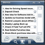


They belong to TreoMemo, Picsel Viewer and Contact5, three very good application who share a particularly refined user interface which contrasts with the "dull" look and feel of the typical PalmOS application (see such an example below:)


Those last two screenshots belong to CacheLogBook and WineMate, two fine freeware applications available for the PalmOS platform. Of course, it's not surprising to see that commercial applications have much more polished interfaces than freeware ones, but this isn't actually where I want to lead you... ;-)
When considering the three polished interfaces from the first screenshot rows, I see three applications which, while they are good and own a cleverly thought UI when taken individually, are completely different, with different choices for icons, buttons, menus (Picsel Viewer is probably the application with the strangest menu design I know of on a PalmOS device). The result, IMHO, is mostly user confusion. Every time you launch another application, your brain has to adjust to its particular interface, whereas "simple" applications like the ones on the second row share a "common interface" as far as look and feel is concerned, so the end user will expect to find a popup menu when tapping on the title bar, to have working keyboard shortcuts that are consistent throughout the whole range of applications, which will result in a productivity boost in the long run. I'm a fervent follower of the "Zen of Palm" guideline, because I feel it makes a lot os sense in an ergonomic point of view, although I admit that it leads to some heavy restrictions on the graphical look of the PalmOS applications.
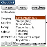
Now I don't pretend that there's no need to revamp the UI a bit, and the following screenshot, taken from the HikeAssist application, shows that Palm could keep basically the same interface elements as we know them today, and simply make them a bit "sexier" graphically. I don't think that this would cause too much processor overhead, and yet it would probably considered an acceptable "improvement" for everyone except the most fanatic, die-hard PalmOS addicts!
What is evident here is that since there are so many "styles" of PalmOS devices users, one size obviously does not fit all, and Palm needs to put some degree of flexibility into its OS, as far as UI customization go. But on the other hand, as pointed by some in Kent's blog comments (or acknowledged by Kent himself), UI customization third party apps tend to make the whole OS slower and more crash-prone, so Palm may not be willing to jump for the whole "bells & whistles" UI set immediately.
It's really too bad that Cobalt never made it onto an actual device, as I did like the look of it. On the following screenshot you can see that PalmSource had done some good work on the bottom bar (not too large, and a lot of info packed down there, although I'd have gone for a bit more color. Color can convey informations in a space-limited environment in a very efficient way):

While the article is very well written, and illustrated with great UI mockups which are certainly appealing, I have the feeling somehow that Kent is obviously not sharing the same views on the UI than I (and lots of other users) do. Reading the comments to his blog entry, I see a sort of mini flame war raging.
While I consider myself a "long time" PalmOS enthusiast (my first Palm was a Palm V) I do realise that there are a number of people who have been using the PalmOS for even longer time, so nothing here should be interpreted as definite statements, only my own point of view.
One of Kent's hope is that the UI receive a few changes like:
1) Scrollbars. Yes, I do agree, the raw PalmOS scrollbars are a bit to narrow, even for my own taste, and it sure wouldn't take a genius programmer to make them bigger. The ideal situation could be to have their width user selectable within a given range of pixel width. The problem with this is that the applications developpers would have a hard time adjusting their application to the user-selected scrollbar size... :-(
2) A separate application bar and sytem icons bar. While that makes sense in a graphical point of view (i.e. it's nicer to look at, and give very interesting informations if you want them (battery level, signal level for the phone, time/date...). One problem with this, emphasised in some comments to his post, are that such a big bar eats a lot of screen real estate, leaving you with a smaller "useable area" to display text, buttons, whatever your program interface has to display. Kent obviously loves the wide screens (and I certainly do, having owned some great devices with Hires+ 320x480 screens), but on devices like smartphones, you have to chose between a big screen and a keyboard, unless the size gets so bulky most people won't bother purchasing the monster... So you have to be very carefull and design a UI that can accomodate both big and small screens. Tricky, at best!
3) A bottom "quicklaunch" bar with selectable icons also seems like a good idea, although it does eat another couple of rows of precious pixels. But if done inteligently, and combined with the top bar, this can be very efficient (see the Cobalt screenshot at the end of this article for a nice bottom bar)
4) Nice backgrounds, transparency gradients, animated icons, etc... makes for a very polished interface look, and are certainly really appealing, but honestly, I've been dumping apps in the past because you couldn't get rid of those "eyes candy" which, in my case, mostly disturb my attention from the task I'm trying to acomplish (create a memo, check a contact address, send an email...). The key here is that all thos settings, if incorporated into the interface, should be entirely configurable on a one by one basis. I'd trade a longer battery life any day to having the opportunity to put a background image to the Memopad application. Backgrounds, for my eyes, only make it difficult to read the text displayed at the front, and they tend also to be RAM and processor-hungry. But to some (and their number is faaaaar from being small, I'd venture), those "eye candies" are what make a devices pleasant to use, so Palm obviously cannot make new devices without considering this request.
 Some PalmOS devices do handle this screen limited real estate as best as the manufacturer could do, like for instance the SGH-i500 Samsung PalmOS phone. On the left picture, you can see that on top of the square display Samsung has added a supplementary icon bar showing the signal level and battery life. I'm pretty sure that some other icons could be displayed up there, so with a very limited cimension increase (we're taklking here to add 16 pixels, not jump from a 320x320 to vertical 320x480 screen), you can cram more information without having to re-invent the PalmOS interface and create too many incompatibility issues (I'm sure everyone remember the release of the first 240x240 square displays for Windows Mobile devices, and how many applications designed for 320x240 screens wouldn't run at all before they were updated).
The bad thing with this approach is that you still have to put your hands inside the built-in applications code, otherwise you end up with what can be seen as well on the Samsung phone: the usual blue battery icon in the Application titlebar, and the additional red batery icon in the top right corner of the screen... It makes no sense duplicating those informations, it just shows that this phone was kind of "rushed" to the market without polishing the UI.
Now look at the three screenshots below:

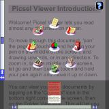

They belong to TreoMemo, Picsel Viewer and Contact5, three very good application who share a particularly refined user interface which contrasts with the "dull" look and feel of the typical PalmOS application (see such an example below:)
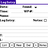
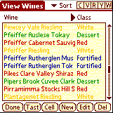
Those last two screenshots belong to CacheLogBook and WineMate, two fine freeware applications available for the PalmOS platform. Of course, it's not surprising to see that commercial applications have much more polished interfaces than freeware ones, but this isn't actually where I want to lead you... ;-)
When considering the three polished interfaces from the first screenshot rows, I see three applications which, while they are good and own a cleverly thought UI when taken individually, are completely different, with different choices for icons, buttons, menus (Picsel Viewer is probably the application with the strangest menu design I know of on a PalmOS device). The result, IMHO, is mostly user confusion. Every time you launch another application, your brain has to adjust to its particular interface, whereas "simple" applications like the ones on the second row share a "common interface" as far as look and feel is concerned, so the end user will expect to find a popup menu when tapping on the title bar, to have working keyboard shortcuts that are consistent throughout the whole range of applications, which will result in a productivity boost in the long run. I'm a fervent follower of the "Zen of Palm" guideline, because I feel it makes a lot os sense in an ergonomic point of view, although I admit that it leads to some heavy restrictions on the graphical look of the PalmOS applications.
Now I don't pretend that there's no need to revamp the UI a bit, and the following screenshot, taken from the HikeAssist application, shows that Palm could keep basically the same interface elements as we know them today, and simply make them a bit "sexier" graphically. I don't think that this would cause too much processor overhead, and yet it would probably considered an acceptable "improvement" for everyone except the most fanatic, die-hard PalmOS addicts!

What is evident here is that since there are so many "styles" of PalmOS devices users, one size obviously does not fit all, and Palm needs to put some degree of flexibility into its OS, as far as UI customization go. But on the other hand, as pointed by some in Kent's blog comments (or acknowledged by Kent himself), UI customization third party apps tend to make the whole OS slower and more crash-prone, so Palm may not be willing to jump for the whole "bells & whistles" UI set immediately.
It's really too bad that Cobalt never made it onto an actual device, as I did like the look of it. On the following screenshot you can see that PalmSource had done some good work on the bottom bar (not too large, and a lot of info packed down there, although I'd have gone for a bit more color. Color can convey informations in a space-limited environment in a very efficient way):
posted by Patrick Robbe at 13:45
![]()
![]()


0 Comments:
Post a Comment
<< Home